Y-Axis on both sides of graphs in Excel
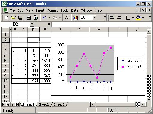
Sometimes there is the need for comparing two sets of data that have totally different ranges (eg: first set varies between 1 and 10 and second set between 100 and 1000).
Creating one graph for this with one vertical Y-Axis only will give something like the example. No chance of seing the small part accurately.
Now if you change the settings slightly. It will become like this.
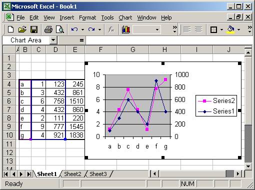
and it is much more visible.... !!!!
Changing the settings is done as follow:
- in the graph, right click on the line you want to have the y-axis on the other side.
- select "format data series" menu
- select "axis" tab
- click on "secondary axis"
- Done!
tip: you can also change the type of graph of the second axis by selecting "chart type".
Updated September 12th, 2010
Contact: admin@Excelmadeeasy.com
You are visitor no: 1901